VisitBritain/Rod Edwards

News, insights and resources for tourism and business events professionals
Welcome to Visit Britain Industry site
Welcome to the website for VisitBritain/VisitEngland - the national tourism agency. Here you’ll find support for industry professionals through the latest news and information, data and resources, and business development opportunities.
We’re passionate about raising Britain’s profile, increasing the volume and value of tourism exports, and developing England’s visitor economy by working with organisations of all sizes and specialities.
From expert guidance to market intelligence, read on to find out how we can work with you.
Explore our curated information for...
Everything you need to inspire your clients. Discover new products, experiences and itinerary ideas – plus useful resources and the latest market insights.

Access resources for business events to support your business development and event strategy. Discover England, Scotland and Wales' business event offering for your next conference, incentive, exhibition or event.

Build sustainable and valuable growth. Learn about England’s new destination management structure, find expert advice, and boost your proposition with our training and toolkits.

Reach new customers and increase your profitability. Drive sales with our tools, events and training, find out about quality assessment and get expert guidance from the England Business Advice Hub.

Discover our media centres, image and video library and latest press releases, plus contacts for our corporate and consumer press teams.

Studying tourism at school, college or university? We’ve gathered essential resources and data for students of tourism, plus information about our internships.

Everything you need to inspire your clients. Discover new products, experiences and itinerary ideas – plus useful resources and the latest market insights.

Access resources for business events to support your business development and event strategy. Discover England, Scotland and Wales' business event offering for your next conference, incentive, exhibition or event.

Build sustainable and valuable growth. Learn about England’s new destination management structure, find expert advice, and boost your proposition with our training and toolkits.

Reach new customers and increase your profitability. Drive sales with our tools, events and training, find out about quality assessment and get expert guidance from the England Business Advice Hub.

Discover our media centres, image and video library and latest press releases, plus contacts for our corporate and consumer press teams.

Studying tourism at school, college or university? We’ve gathered essential resources and data for students of tourism, plus information about our internships.

Latest news and press releases
Explore ways to work with us
Research and insights
Getty Images

Research and insights
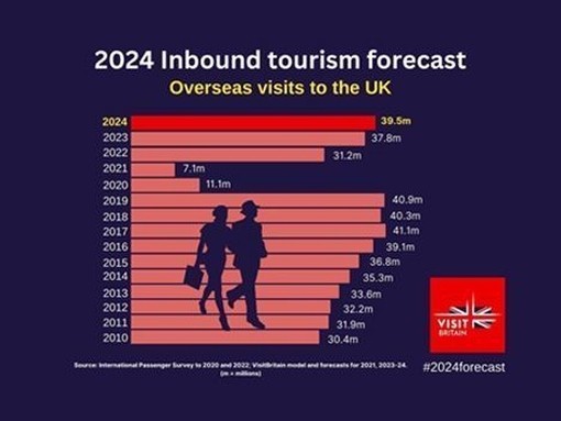
Find the latest consumer and industry data and insights on domestic and inbound tourism in the UK, Britain and England. Learn about key previous trends, and explore those that are set to influence the industry in years to come.
The latest news, straight to your inbox
The latest news, straight to your inbox
Register for newsletters compiled by our specialist teams – for UK businesses, the international travel trade and media professionals. Packed with news, resources, events and market intelligence.
Register for newsletters compiled by our specialist teams – for UK businesses, the international travel trade and media professionals. Packed with news, resources, events and market intelligence.


